This is the second of two articles. In the first piece we explored Ruben’s magnificent Baroque altarpiece, the Raising of the Cross. Now we’ll take a close look at his Descent From the Cross, which is of similar size but quite distinct in composition and artistic sensibility.
Although I normally focus on art sites in the US, during this week leading up to Easter I want to consider two monumental Rubens altarpieces that are in the Cathedral in Antwerp, Belgium. I studied them in depth 15 years ago — when I was preparing my audio guide to Our Lady Cathedral, Antwerp — one of ten audio-tour titles in the Jane’s Smart Art Guides series — and I always think about them at this time of year.
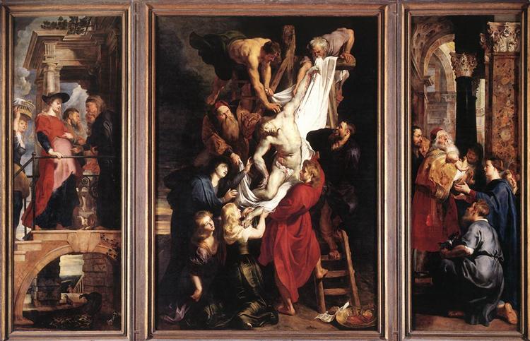
In 1610, with the Raising of the Cross Rubens introduced the Baroque to Northern Europe, glorifying the artistic ideals of the Counter-Reformation. Soon thereafter (1612–1614), he was commissioned to paint the Descent From the Cross for the altar in the Arquebusiers Guild’s chapel in Antwerp’s Cathedral. (An arquebus is a type of gun that predated the musket.)
While the two triptychs are of virtually the same size, comparing their style and composition suggests that, after being home from Italy for a bit, Rubens began to tone down the Baroque exuberance he had absorbed in that impassioned sunny land. Yes, the Descent from the Cross has been called a Baroque masterpiece — perhaps due to its monumentality — but it is also considered to be the first work of Rubens’ “Classicist” period, which characterized his style from about 1612 to 1620.
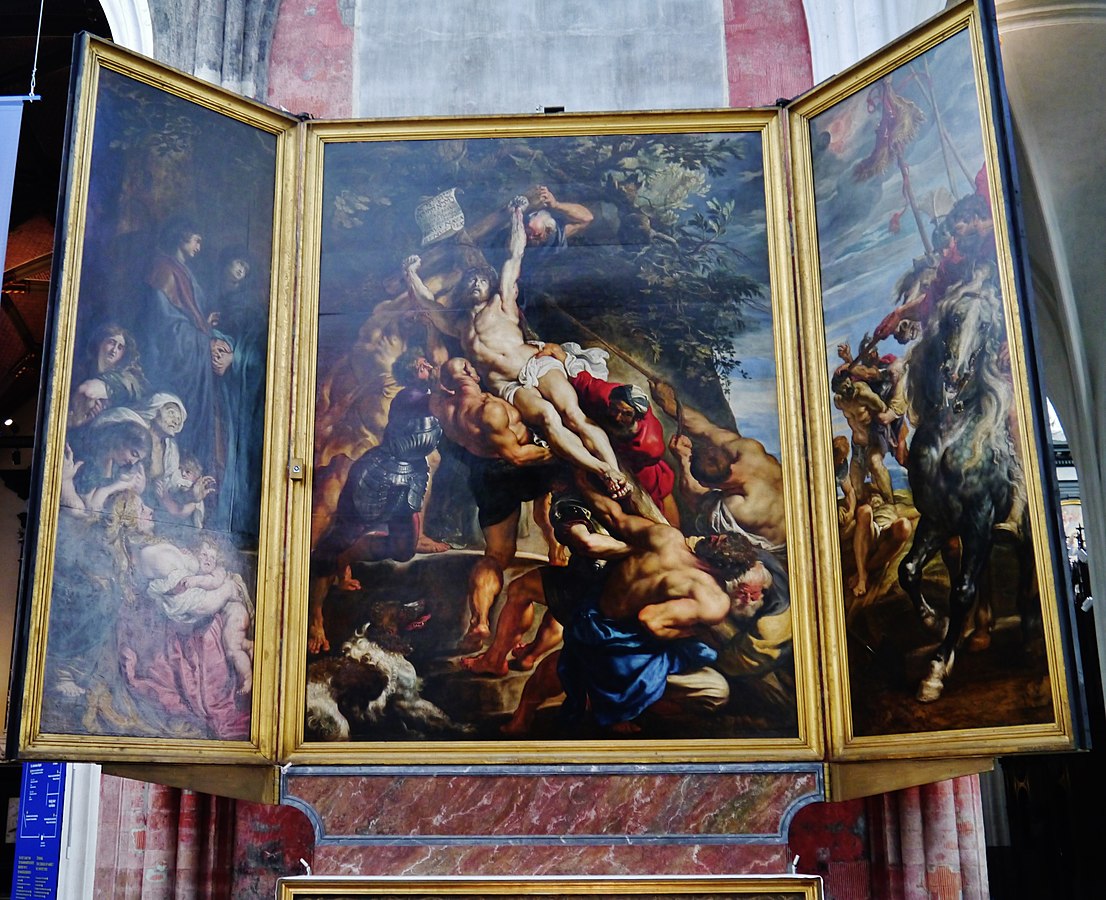
Raising of the Cross, in situ
Antwerp Cathedral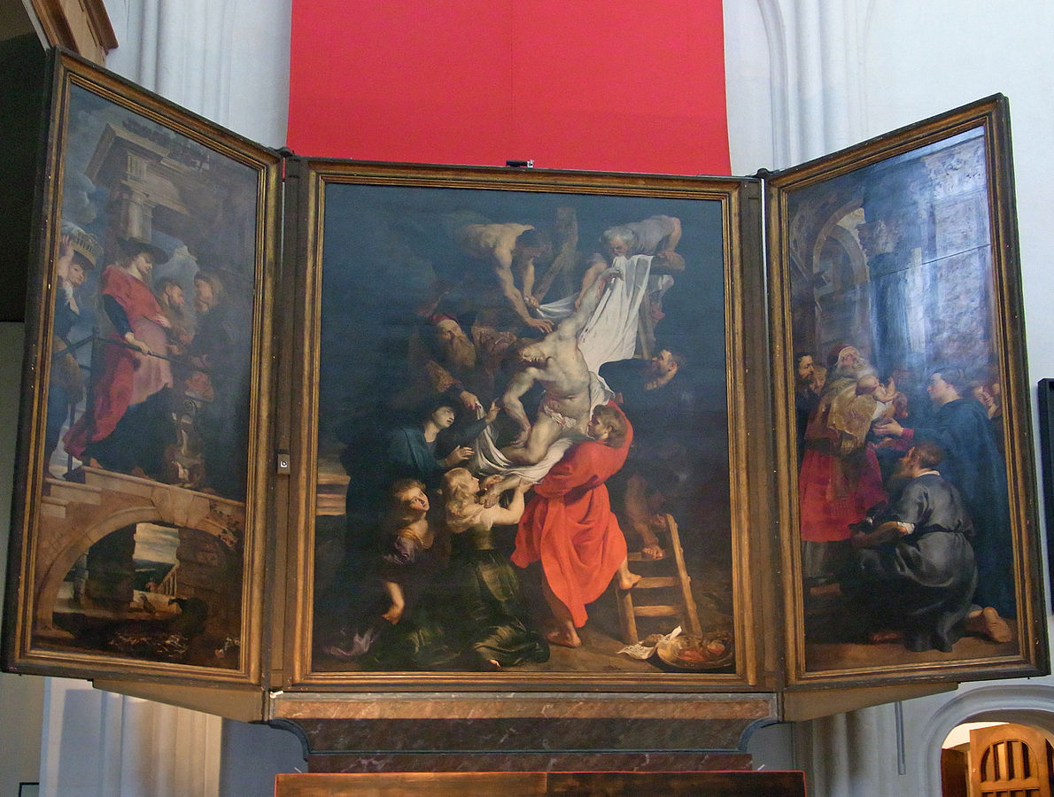
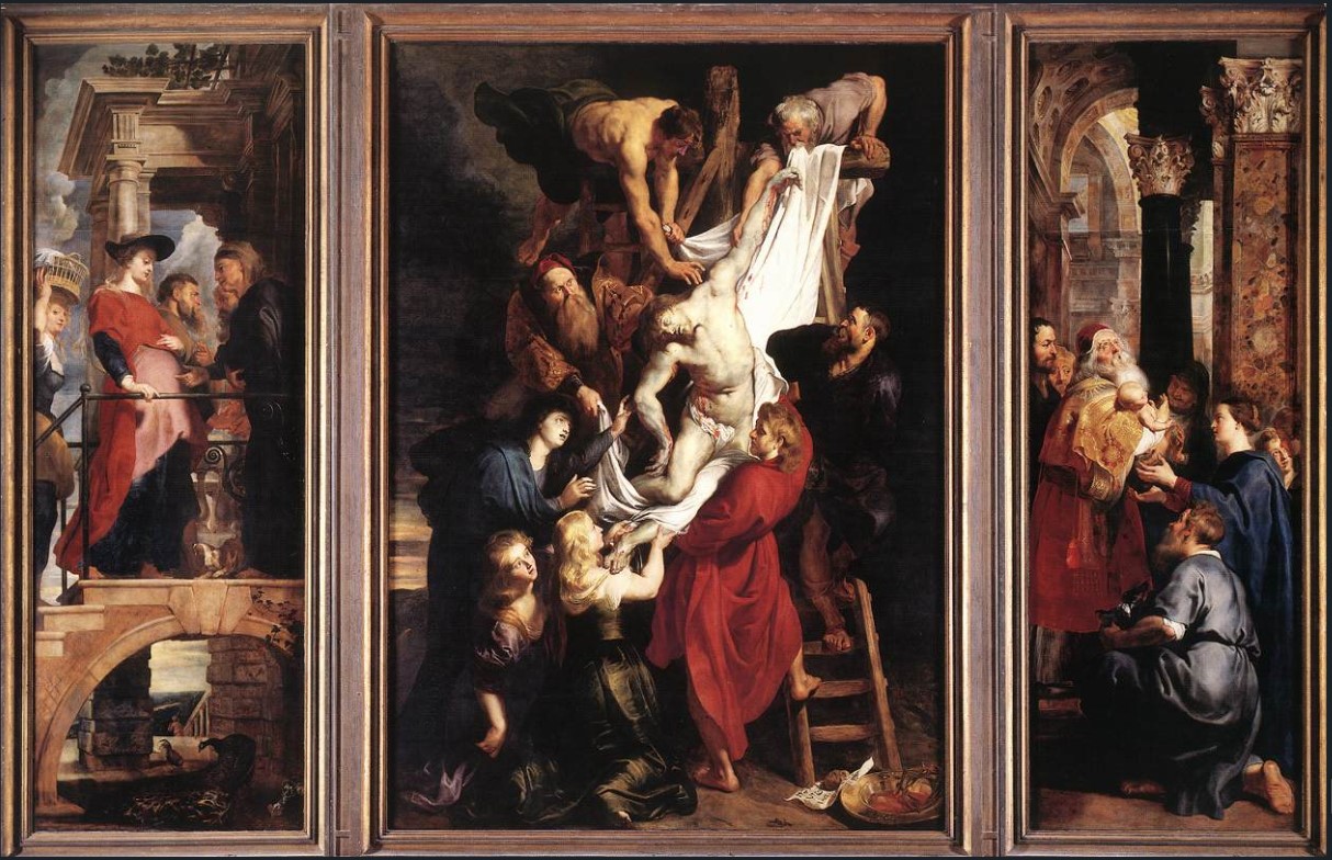
Descent from the Cross, in situ
Antwerp Cathedral
John Rupert Martin, a Princeton University Professor of Art History, says, “Whatever one may think of the validity of such labels as ‘Baroque’ and ‘Classical” as characterizations of the Raising of the Cross and the Descent from the Cross, there is no denying that these two paintings are shaped according to very different principles of composition.”
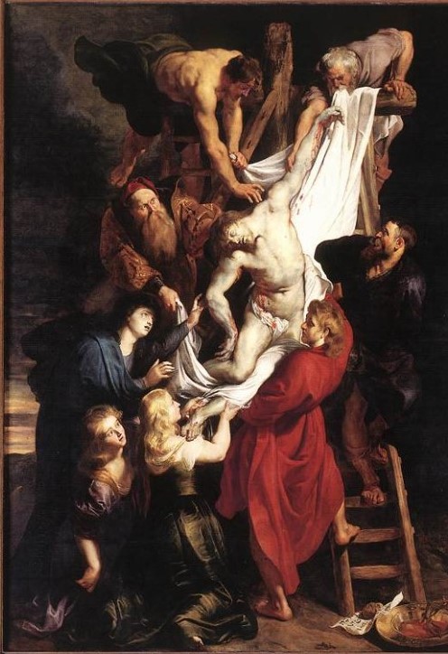
The Descent from the Cross has a discipline and restraint that clearly distinguishes it from the energy that exudes from the Raising of the Cross, painted just 2 years before.
The composition of the Descent is simplified, the light is concentrated, the figures grouped along a unifying line on a flat plane. The movement in the scene is deliberate, careful, and gentle. A surrounding blackness contrasts with the blanched diagonal that is washed in a mysterious, heaven-sent shaft of light.
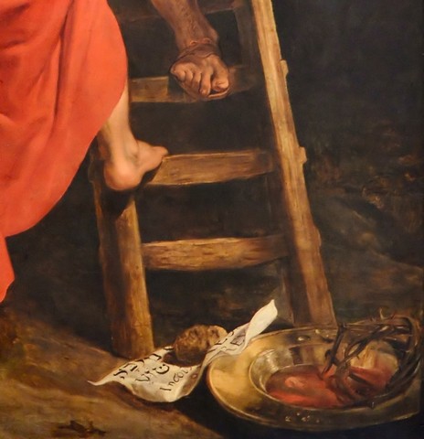
Only the essentials are here: two wooden ladders, and on the ground at the lower right is the superscription held down by a rock, and a brass bowl containing the crown of thorns, the nails, and blood.
Crucifixion was usually a slow and tortured death, with breath sometimes lingering for two days. It was the Roman custom to then leave crucified corpses to the carrion birds, and later to throw the remains into a communal grave. But Jewish law required that the body be buried before sunset on the day of death, and his followers knew this was particularly important for Jesus, for it was the eve of the Sabbath, and moreover, the Sabbath of Passover. (Note the waning light of day at the left margin.)
The Gospels of John and Mark tell us that Joseph of Arimathea obtained permission from Pilate to bury Jesus, and with Nicodemus and two servants, went to take him down from the cross. There he met St. John the Evangelist and the three Marys, and together they removed the nails from his hands and feet and lowered him in a linen winding sheet to the ground.
Rubens’ Descent includes only this intimate group of eight prescribed followers. Their intense engagement in this loving undertaking serves to concentrate the viewer’s emotional response. There’s nothing expendable, no unnecessary figures or secondary scenes to distract our attention from this grievous moment in time.
The simplicity and unity of the composition establish the eloquent poignancy of the event. It’s a testament to Rubens’ extraordinary skill that he could convey such tenderness and devotion without any hint of sentimentality.
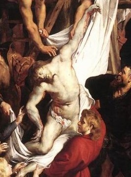
When he visited Antwerp in 1781, Sir Joshua Reynolds — one of the principal English painters of the 18th century — was impressed by the technical excellence of the Descent From the Cross. He wrote, “The truth is, none but great colorists can venture to paint pure white linen near flesh; … [Rubens’] Christ, which I consider one of the finest figures that ever was invented … is most correctly drawn, and … in an attitude of the utmost difficulty to execute.
The hanging of the head on his shoulder, and the falling of the body on one side, gives such an appearance of the heaviness of death …”
Rubens was often inspired to borrow ideas from art he admired. For example, despite the huge difference between the two compositions, Rubens’ Descent suggests he made an intimate study when he was in Rome of Daniele da Volterra’s Descent from the Cross (c. 1545), in the church of Trinità dei Monti.
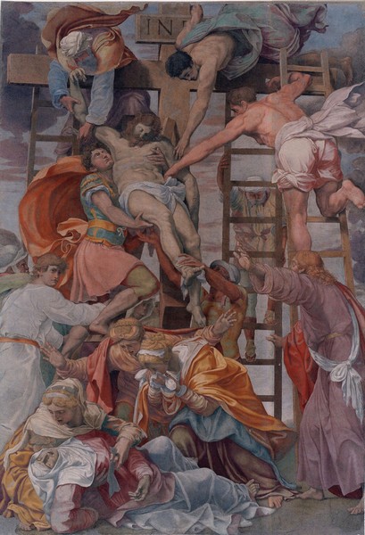
Trinità dei Monti, Rome.
Again, Rubens developed his Christ and Nicodemus figures from the art of classical antiquity. This sort of imitation of a predecessor’s work is called a “quotation,” but in this case it is actually a “translation” since the original is a sculpture that was discovered in Rome in 1506 … the famous Laocoön and His Sons, now in the Vatican Museum.
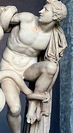
Laocoön’s son detail 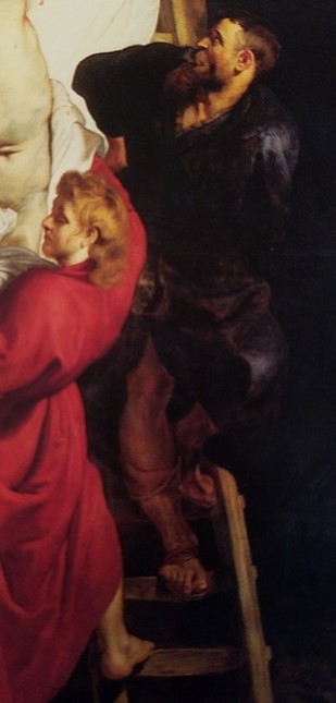
Nicodemus detail
In Rubens’ day the Laocoön was regarded as the epitome of pitiable human suffering, so it is not surprising that Rubens interpreted it for this deposition. It was the relationship between them and the physical position of the son to Laocoön’s left that Rubens quoted.
The scenes on the side shutters of the two Rubens altarpieces point to another notable compositional difference between them. The left and right panels of the Raising of the Cross are integrated with the drama of the central theme, linking the triptych into a unified composition. By contrast, the side panels of the Descent are not related to the center-panel theme.
Or are they?
As was the custom, the Arquebusiers Guild wanted their patron saint, St. Christopher, to figure prominently in the theme of their altarpiece. However, St Christopher’s legend is rife with mythology, and he had not fared well in the Jesuits’ legitimizing investigation of the “Actual Lives of the Saints” — so his cult wasn’t sanctioned.
The Council of Trent had mandated in 1563 that nothing promoting “false doctrine, superstition, or lasciviousness, nothing that is profane and nothing indecorous” should appear in art. By this they meant, not only no unduly naked figures but also no religious pictures too full of imagination and myth, and no treatment of legendary scenes from the lives of the saints. It was further stipulated that the central panel of any triptych hung above an altar should portray Christ or a scene from the New Testament.
Finding a New Testament theme for the center panel posed no problem, and Rubens was fully able to rise to the side-shutter challenge. He simply conceptualized the meaning of the name Christopher – from Christophorus, which means “the Bearer of Christ.” So, in fact, the scenes on the two open shutters are linked thematically with the center panel, all three sections of the triptych telling a story relating to the bearing of Christ.
It’s easy to understand why St. Christopher was disqualified by the Council of Trent. His legend tells us that a 3rd-century Canaanite of giant proportions named Reprobus wanted to serve the most powerful king. After wandering for a very long time, he came across a hermit living near a fast stream, who told him something to the effect of, “God will come to you.”
So Reprobus settled at the edge of this river and began to help travelers ford the strong current. One day a small child appeared, wanting to cross. Reprobus lifted him onto his shoulders and strode into the fast-flowing water, but the small burden he was carrying became heavier and heavier, until the giant was staggering under the weight. Leaning laboriously on his staff, guided by the hermit’s lantern, he finally made it to the opposite bank, at which point his passenger said, “I am the king thou seekest. Thou hast borne upon thy shoulders Christ who bore all the sins of the world upon his own.”
That’s how Reprobus became Christopher, the bearer of Christ. And how St. Christopher became the patron saint of travelers. And why the Council of Trent considered him legendary and not a canonized historical figure.
But a guild altar without an image of their patron saint would have been unthinkable!
In the central scene, all eight figures are involved in releasing the dead Christ from the cross. His mother Mary reaches out to him, Mary Magdalene supports on her shoulder one of Jesus’ feet that she had previously anointed, and the rest tenderly lower his weight to the ground. These are the most faithful, and the last bearers of Christ.
On the left panel, the scene is the Visitation, wherein a visibly pregnant Mary, bearing Christ in her womb, arrives at the home of her cousin Elizabeth.
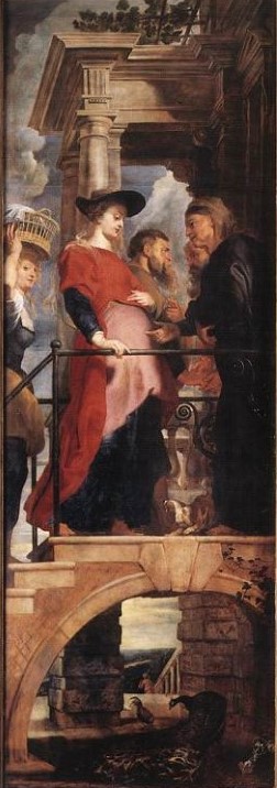
On the porch, a pet dog barks joyously as the aging Zachariah and Elizabeth greet Joseph and Mary. At the moment she hears Mary’s salutation, Elizabeth and her own unborn son recognize the divine authority in Mary’s womb.
From the 14th century on, it was not uncommon for painters in Northern Europe to portray Mary in late-term fullness, as we see her here. Intent on illustrating the significance of the Visitation, Rubens joined those artists in ignoring the gospel of Luke which relates that Elizabeth was six months further along in her own miraculous pregnancy — carrying John the Baptist – than was Mary in hers.
Just entering the picture on the left, a step or two below the landing, is a servant girl who looks out at us provocatively. Rubens undoubtedly included a figure there for compositional balance — to act as a left-bracket to Elizabeth’s right-bracket — and in a touch of mannerism, to juxtapose youth and old age. But she’s a balancing figure in symbolic ways as well. Her lively earthiness complements Mary’s purity and spiritual serenity, and she represents servitude to the affirmation of Jesus’ sovereignty. Her come-hither eyes invite us to participate in the moment of revelation.
The composition of the side shutters of a triptych was always a challenge because of their tall, narrow frame. This a great example of Rubens’ creative problem-solving. He placed the figures on a raised porch, but to avoid having a massive architectural feature dominating the foreground, beneath the porch he opened up a slice of vista through an arch. In the Flemish tradition of detail, he’s given us chickens and a peacock and a small middle-distance figure heading down a hill, with a local Netherlandish landscape stretching out to the horizon.
It’s not so much vista as to compete with the scene above, but enough to introduce some depth and light into the lower third of the panel.
On the right-hand panel, Simeon bears Christ in his arms in the Presentation of Jesus to God in the Temple. Joseph kneels, holding the two sacrificial turtle-doves he brought according to the law. Mary anticipates the return of Jesus to her arms. Looking on behind Simeon, in profile, is the Arquebusiers’ dean, Nickolaas Rockox, who was also a friend to Rubens.
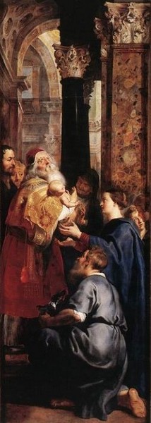
According to Luke, Simeon was an aged, just and devout man, who was ready for his own death, but he had a revelation that he would not die until he had seen the Messiah, and that he should go to the temple this day. And he went and met Mary and Joseph and took up their child in his arms and said, “Lord, now let thy servant depart in peace, according to thy word; for mine eyes have seen thy salvation … .”
The top half of the shutter is filled with glorious classical architectural elements: a coffered ceiling, colorful marble pilasters, black marble columns, Corinthian capitals, arches, and cornices. An open window high in the back wall alleviates the mass of stone and enhances the sense of depth, in the same way as does the vista under the porch on the left shutter. The single visible window indirectly suggests others, to explain the light sources on the figures and in the room behind.
A number of Rubens’ preparatory sketches indicate that he tried out various ideas for the interior of the temple before arriving at this one. He was looking not only for a solid composition for the panel in and of itself, but also for the formula that would draw the three panels of the triptych into a unified composition. His solution strengthened the principal subject by anchoring the diagonal at each end, linking the arch and vista at the bottom left with the arches and sky at the upper right.
When the side panels were open, the Council of Trent proscription had to be respected. But when closed, the shutters could — and do — show a scene from St. Christopher’s legend.
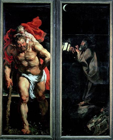
St. Christopher and the Hermit, left and right panels, shown closed
Rubens’ conceptual creativity allowed the Arquebusiers to have their patron saint over their altar. When the left and right shutters were closed across the center panel — as they always were except at appointed times — the altarpiece appeared as two panels. Rubens captured the apotheosis of St. Christopher’s tale in an incandescent visual narrative — and the commissioning Guild was pleased.
Read the companion article, about the Raising of The Cross, here.
Art Things Considered is an art and travel blog for art geeks, brought to you by ArtGeek.art — the search engine that makes it easy to discover more than 1300 art museums, historic houses & artist studios, and sculpture & botanical gardens across the US. Just enter the name of a city or state to see a complete catalog of museums in the area. All in one place: descriptions, locations and links.
We absolutely love your blog and find the majority of your posts to be precisely what I’m looking for. Do you offer guest writers to write content in your case? I wouldn’t mind publishing a post or elaborating on a few of the subjects you write regarding here. Again, awesome website!
Thanks for your enthusiasm! We don’t host guest writers, I’m afraid, but you are welcome to elaborate on any of our posts in the comments section. We welcome readers’ input!
Hi, I do believe this is a great site. I stumbledupon it
😉 I am going to revisit yet again since I book marked
it.
Thank you for this! Do you think the young woman at the far left is his first wife, Isabella Brant?