There are two art treasures in Antwerp’s Cathedral of Our Lady that stand out above all the rest, both painted by Peter Paul Rubens: The Raising of the Cross and The Descent from the Cross.
While I normally focus on art sites in the US, this week before Easter seems like a good time to take a look at these two magnificent triptych paintings. I studied them in depth 15 years ago, when I was preparing my audio guide to Our Lady Cathedral, Antwerp, one of ten audio-tour titles in the Jane’s Smart Art Guides series.
In this first of two articles, we’ll explore the Raising of the Cross. In size, composition and iconography it is resplendent with the artistic ideals of the Counter-Reformation.
Painted in 1610, The Raising of the Cross was the first important religious commission Rubens received after he returned home from eight years living in Italy, where he studied Roman antiquities and the art of Renaissance, Mannerist and early Baroque painters. Among the artistic innovations he brought home to Catholic Flanders was a preference for the monumental scale, which was common in Italy and was well-suited to the ambitions of the Counter-Reformation.
With this sensational painting, Rubens introduced the Baroque into Northern art. For decades, local artists had been producing inert classicist work, and nothing near this monumental size. The painting is 15’ high and the center panel alone is 11’ wide. Imagine the effect this must have had when it was unveiled!
The twisting, almost impossible poses, the exaggerated muscled bodies, the expressive faces, all this tells us that Rubens was greatly influenced by Michaelangelo and by Italian Mannerism. Mannerism was a reaction against the rules of Classical art, seeking ambiguity and tension instead of the harmony and repose of the Classical concept.
Baroque was the next stage in artistic evolution and, while it built on the contributions of Mannerism, what had become important were heroic imagery, compositional patterns, illusionism, the play of contrasts, and unity.
Well-suited to the Counter-Reformation, Baroque demanded large-scale, theatrical scenes, exuding energy, strength, motion, and feeling. Rubens and Baroque were made for each other!
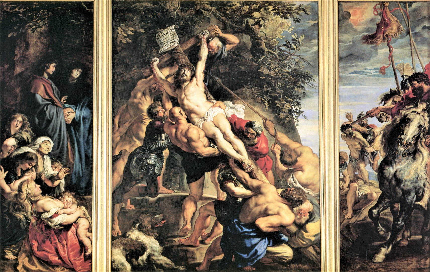
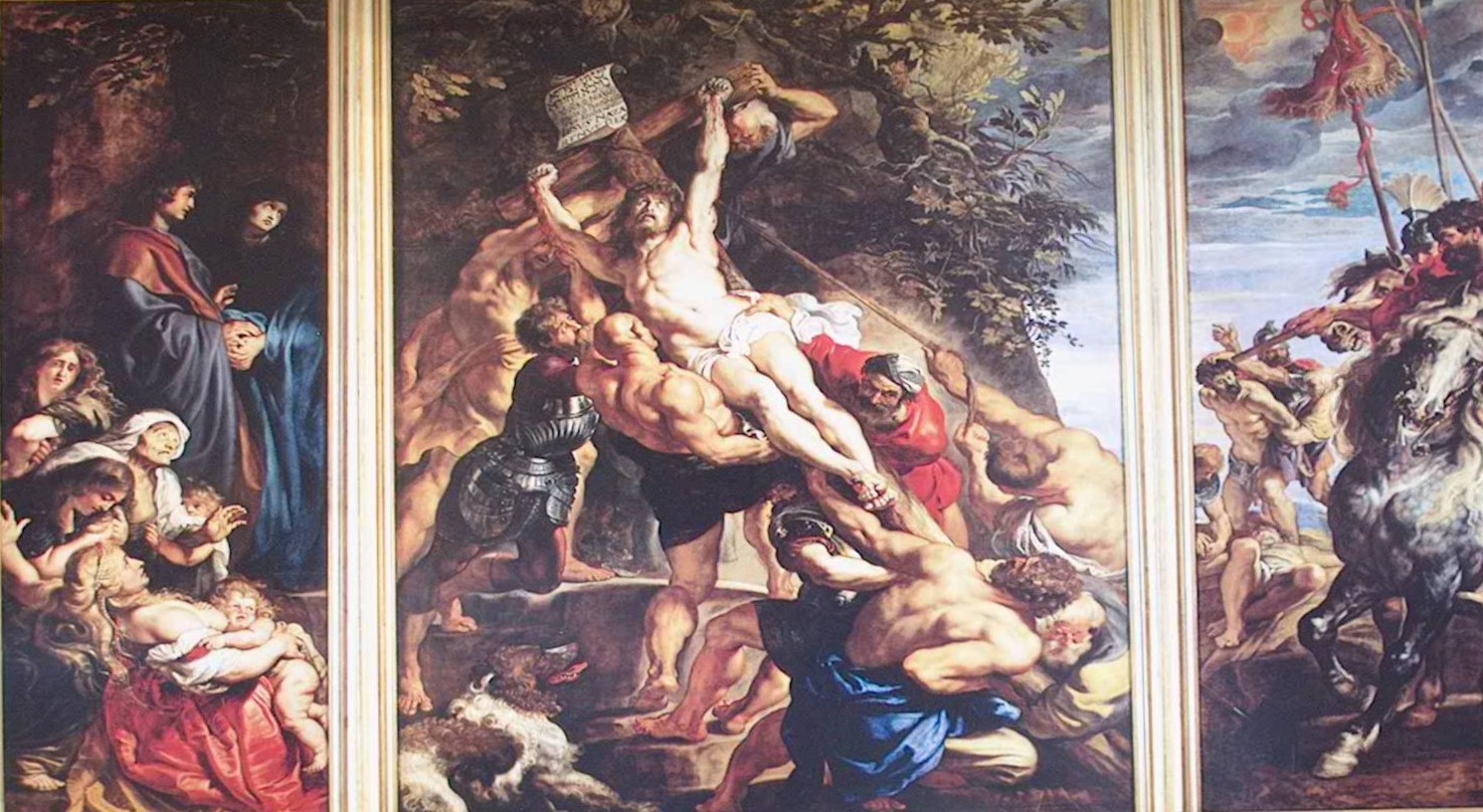
One of Rubens’ talents was his ability to fill a frame with figures, without the composition seeming over-crowded. There are fully nine men straining to erect the cross, and despite the taut muscularity and the extreme physical effort the image projects, there’s no sense of chaos. Instead, what’s projected is the weight of what’s being done … the physical weight of Christ’s body and the heavy wooden cross, as well as the spiritual weight of the crucifixion of the Savior.
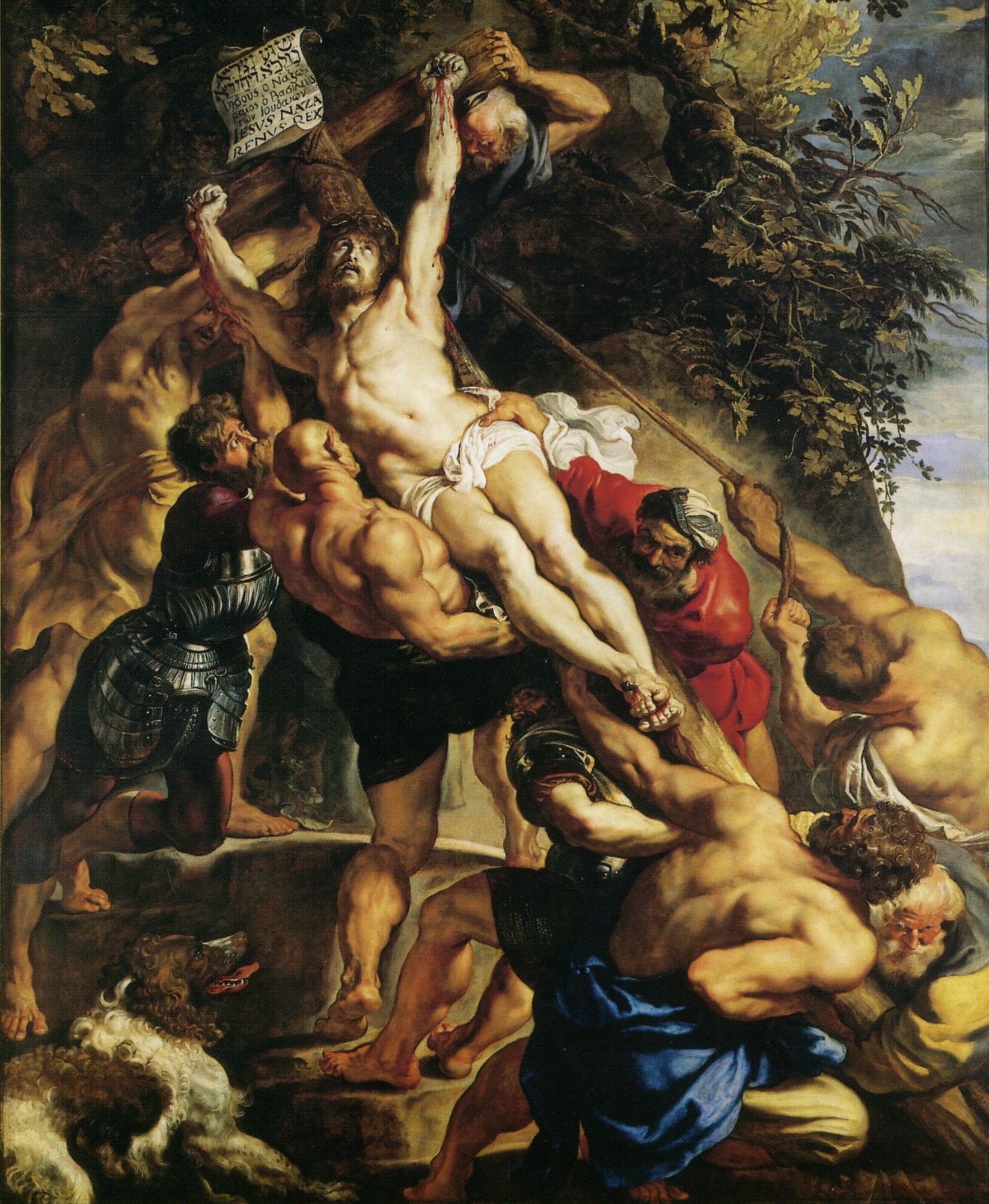
The strong diagonal defined by the cross and Christ’s luminous body forms the axis of an s-curve established by the positions of the executioners and their assistants. The serpentine line starts at the foreshortened figure in the lower-right foreground, moves through the shoulders of the man pulling the rope and the man in red, across to the heavily-muscled executioner, up and through the extended arms behind the top of the cross to the old man below Christ’s left hand.
This device creates movement, bringing the picture to life by linking into one concerted action the efforts of the individual figures and by drawing the eye actively through the composition. The sense of motion and precarious balance draw the viewer into the drama, the action seemingly happening at this very moment.
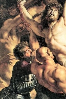
But the heart of at least one of these men is not in the task. Look at the face of the armored soldier. This man is a follower, a weak man who doubts his own actions but is swept up in the fever of the moment. And the man wearing the yellow drape behind Christ’s right arm peers out at us self-consciously, knowing he’s being watched.
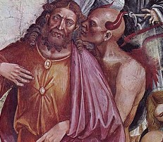
They are flanked by an over-muscled, bald man wearing black. With a little imagination, one might think he represents the devil. Had Rubens stopped to visit the Duomo in Orvieto during his time in Italy? This figure is reminiscent of the Anti-Christ in Luca Signorelli’s San Brizio Chapel frescoes (c. 1500), with prominent humanizing ears in place of horns.
Rubens extended the dramatic scene onto the two side panels, although the narrowness of the shutters, each just under 5’ wide, compelled him to contract the scale and content of these lateral groups.
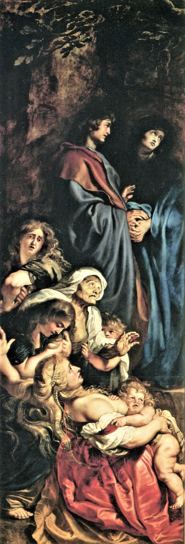
Raising of the Cross, Left panel 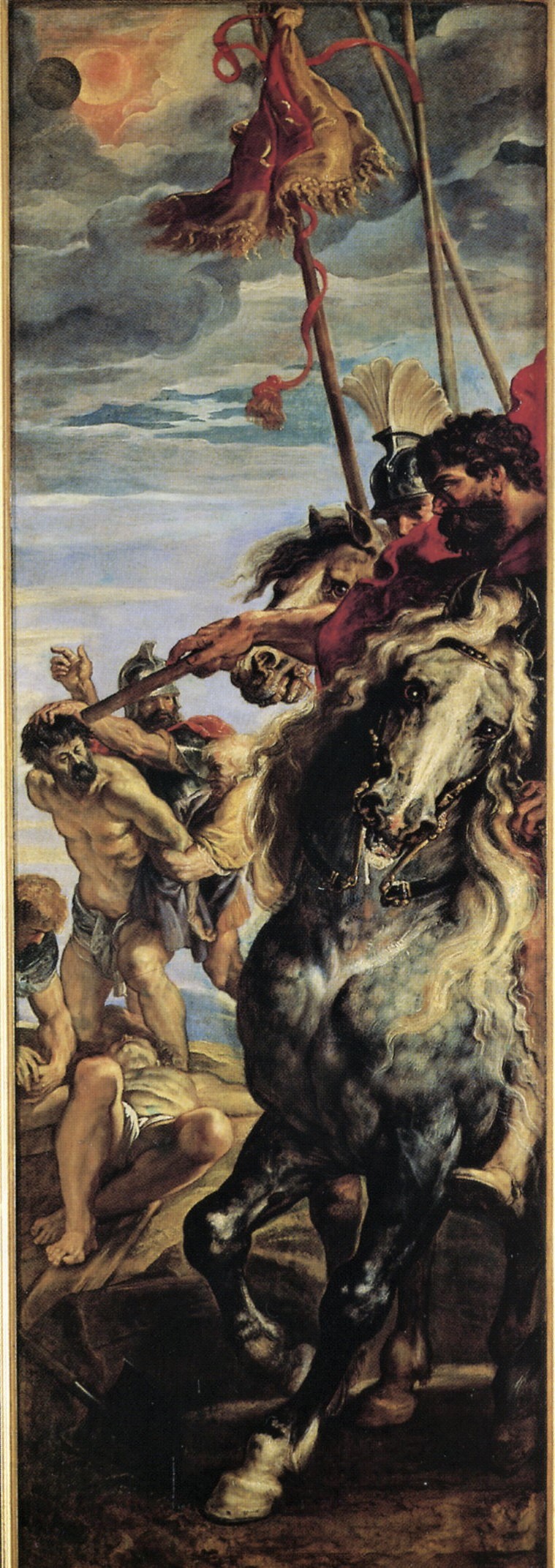
Raising of the Cross, Right panel
Nonetheless Rubens created a strong structural connection between the three panels, in addition to the thematic connection. He introduced another s-curve to link the panels together visually.
Look first at the dog in the lower left corner of the center panel, and then move your eye over the left-hand panel, through the group of horrified women and up to John and Mary; then follow Mary’s gaze back over to the inscription at the top of the cross, track the diagonal defined by Christ’s body and the shoulders of the man in the blue drape to the bottom right of the center panel. Carry on over to the right panel, up through the horse’s left foreleg, chest and head, along the poles and banner, to the point of the eclipse. By following that curve, we’ve taken in the entire composition.
In the Middle Ages the crucified Christ was typically framed only by John the Evangelist and the Virgin, but later Italian artists increased the number of people present, reflecting what is written in the Gospel of Luke, that a crowd had gathered, and of John, that “there stood … his mother, and his mother’s sister, Mary the wife of Cleophas, and Mary Magdalene”.
On the left panel here, a woman in the foreground recoils in dismay, leaning back almost out of the plane of the painting, but we can’t actually identify her or the other women in the group with certainty. Above them stand St. John and Mary, unified in their grief. Italian Renaissance masters most often depicted Mary in a swooning faint, but theologians of the Counter-Reformation called on artists to portray her as mournful, grieving, but remaining sentient and upright, on the strength of her faith.
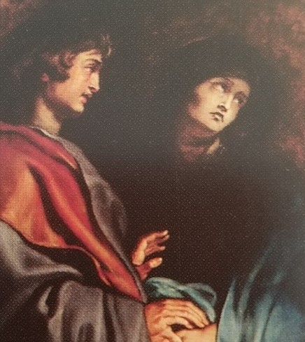
Left panel, detail 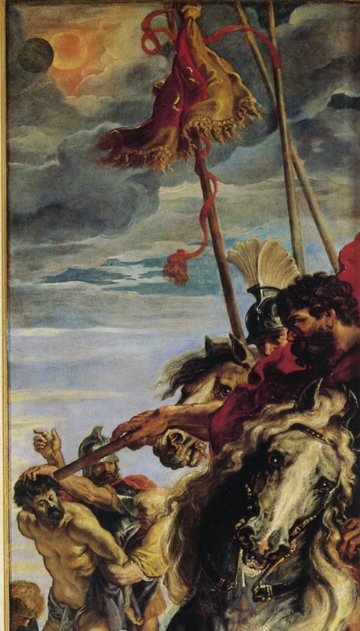
Right panel, detail
To the right, a mounted Roman commander’s wild-eyed horse froths at the mouth. The officer seems oblivious to the raising of Christ on his cross, and is instead intently focused on the crucifixion of the two thieves. As far as the Roman soldiers are concerned, at this stage in the action, this is pretty much a normal crucifixion. It’s only at the moment of Christ’s death that they will realize that something momentous has happened, as the gospels tell of an earthquake and darkness enveloping the land – foretold here by the eclipse forming overhead.
In the writings of both Mark and Matthew, the soldiers declared, “Truly this man was God’s Son!” But by “God’s Son” they didn’t necessarily mean “the messiah,” because in the Greco-Roman world, exceptional people were often accorded divine status. And, since in Jewish literature one of the meanings of “Son of God” was “righteous man” St. Luke interpreted the expression to mean, “Certainly this man was innocent.”
Color doesn’t play a big part in this composition, although it’s far from monochromatic. Touches of color are calculated points of interest, but it’s the powerful play of light and dark, the “chiaroscuro,” that produces the dramatic effect. An intense light shines on the scene from the right, creating deep shadows in contrast. The stark illumination draws the focus of attention to Christ’s pale body, but the light on His face is softer, enhancing the pathos of His unfathomable heavenward gaze.
In addition to this being the painting that introduced the Baroque to Northern Europe, this triptych also has iconographic importance in the history of art in the Netherlands.
The act of raising Christ on the cross never appeared as a theme in painting before the end of the 16th C, not in Italy or anywhere else in Europe. The first known image of Christ’s cross being raised was a print published in a book in Antwerp in 1595, 15 years before this altarpiece was painted. Rubens had tackled the same subject in Italy as early as 1602, but this work is infinitely superior to the first version, which was compositionally incohesive and lacking in drama.
This “working on it until he got it right” was typical of Rubens.
In this masterpiece he reused some of the best compositional ideas and figures that he’d developed for that earlier work. The man with extended arms at the head of the cross, and the colossal, devilish executioner with the naked torso and bald head are taken almost unchanged from the first version.
Rubens took an intellectual and analytical approach to his art, developing ideas over long periods of time, trying them out, modifying them, and then in effect, filing away the successful characters, poses, and compositional approaches for subsequent reuse.
He also absorbed, personalized, and mentally filed away the successful ideas and techniques of others.
In large part, it was this constant searching for the perfect image, this problem-solving and cataloging that allowed Rubens’ workshop to be so prolific.
Interestingly, Rubens never painted this subject again. Once he had “got it right” it would seem he had no urge to address it further, preferring to apply his intellectual energies to new compositional challenges.
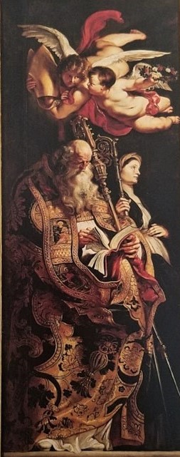
Painted on the reverse of the left side-panel of this massive altarpiece are are two figures — St. Armand and St. Walburga — who were important in the Northern European communion of saints.
Walburga was an Anglo-Saxon missionary to the Frankish Empire, working with Saint Boniface to convert the still-pagan Germans. She was canonized circa 870.
Rubens portrayed St. Walburga on this panel because the triptych was actually intended for the main altar of St. Walburgus, the oldest church in the city of Antwerp. (Built in the 11th century, it was demolished in 1817.)
The high altar at St Walburgus was raised above the level of the nave, reached by an open staircase of some 20 steps. So Rubens — painting the triptych in situ, working undisturbed behind a huge sail stretched across the end of the nave — contrived the composition to be “readable” from a distance, from below, which explains it’s monumental size and the low view point.
Standing in the nave, it would seem as though one were witnessing the raising of the cross from the foot of the hill outside Jerusalem called “Calvary” (in Latin) or “Golgotha” (in Hebrew), meaning “the place of the skull.”
The triptych remained over the altar at the church of St. Walburgus until it was removed by French revolutionaries in 1794 and taken to Paris. Twenty-one years later, following the defeat of Napoleon, it was returned to Antwerp, but St. Walburgus had been used as a customs warehouse and was pretty badly gutted during the French occupation, so the triptych was placed in the Cathedral, where it remains today.
Read the second article, about the Descent From the Cross, here.
Art Things Considered is an art and travel blog for art geeks, brought to you by ArtGeek.art — the search engine that makes it easy to discover more than 1300 art museums, historic houses & artist studios, and sculpture & botanical gardens across the US. Just enter the name of a city or state to see a complete catalog of museums in the area. All in one place: descriptions, locations and links.
I love reading your posts! Informative and insightful. Thank you.