A more welcoming and comfortable experience? Yes and no.
The challenge is to attract new audiences without alienating the old.
Art museums have been facing dwindling audiences for some time as their traditional visitors have been aging out of the picture. On top of that, a sense of discomfort — of not belonging – has always been a barrier for people for whom a visit to an art museum is a novelty.
To attract the next generation of museum-goers, the biggest challenges museums face today are how to appeal to an increasingly diverse population and how to keep up with technological change. Forward-thinking museum administrators and curators are seeking ways to update the experience – and to update the collections themselves — to better represent the expectations of a new wave of visitors.
The “new MOMA” – as people are calling New York’s Museum of Modern Art – is tackling the issue in a head-on, somewhat risky way, pulling together experiments that have been tried, with more or less success, at other modern art museums in the US, Europe and Britain.
The challenge is to attract new audiences without alienating the old.
We came away from our recent visit to the new MOMA with mixed reactions.
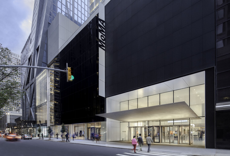
MOMA has just reopened following a $450 million dollar renovation planned by the architects Diller Scofidio + Renfro – the latest in a series of expansions which have occurred regularly since it was built in 1939 — adding a whopping 47,000 square feet of gallery space. The museum was closed during the summer of 2019 for a complete rethink and rehang of what is widely considered to be the world’s finest collection of modern and contemporary art.
Among the stated goals of the project was to “provide visitors with a more welcoming and comfortable experience” as well as to be able to display more of the vast collection. With the addition of several large galleries throughout the museum’s six stories, the floorplan has become extremely spacious, giving curators more walls and floor space for showing new art in new ways.
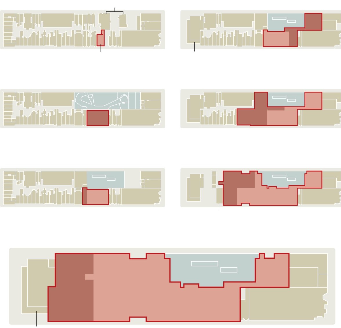
Right column: 1962, 1984, and 2004; New footpint at bottom.
During our previous visit to MOMA, in the Fall of 2017, we were stuck by how packed it was, with crowds of people at every turn, and how confusing the layout was. In an article we wrote at the time, we noted that a companion “lamented that the interior looks and feels like a train station.” The 2004 renovation by the architect Yoshio Taniguchi produced a building of sharp minimalist purity, which had gorgeous architectual features but was not effectively “purpose-built” – with inadequate acoustics and a warrenlike layout.
Happily, during our recent visit we never felt crowded … even though we were there just three days after the grand re-opening. We expected it to be jammed, but congestion has been eased by dispersing visitors through the layout of galleries via multiple pathways. The new east-west orientation of the floorplan is particularly evident in the lobby, which appears to be at least twice the size it was. Much more welcoming!
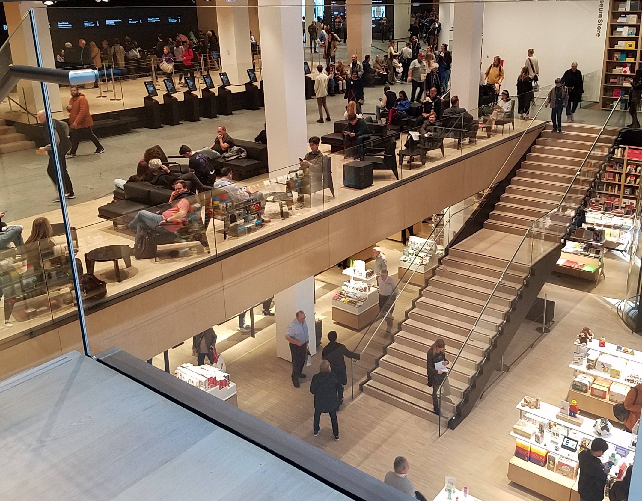
Despite its unfamiliarity, the interior space is much improved – if a tad overwhelming in its volumetrics. Spend a few minutes with the map booklet to get your bearings, or ask one of the “I’m Here to Help” staff to point you where you want to go. (The first guy we asked the whereabouts of the press desk sent us in exactly the wrong direction but, admittedly, that was an unusual request.)
“To be with art is all we ask.” Gilbert & George
“We as institutions are so trained to treat our temporary exhibition program as the main tent,” said Glenn D. Lowry, MoMA’s director. “We made the commitment — financially, programmatically and intellectually –that we’re going to shift that. Our main tent is our collection.”
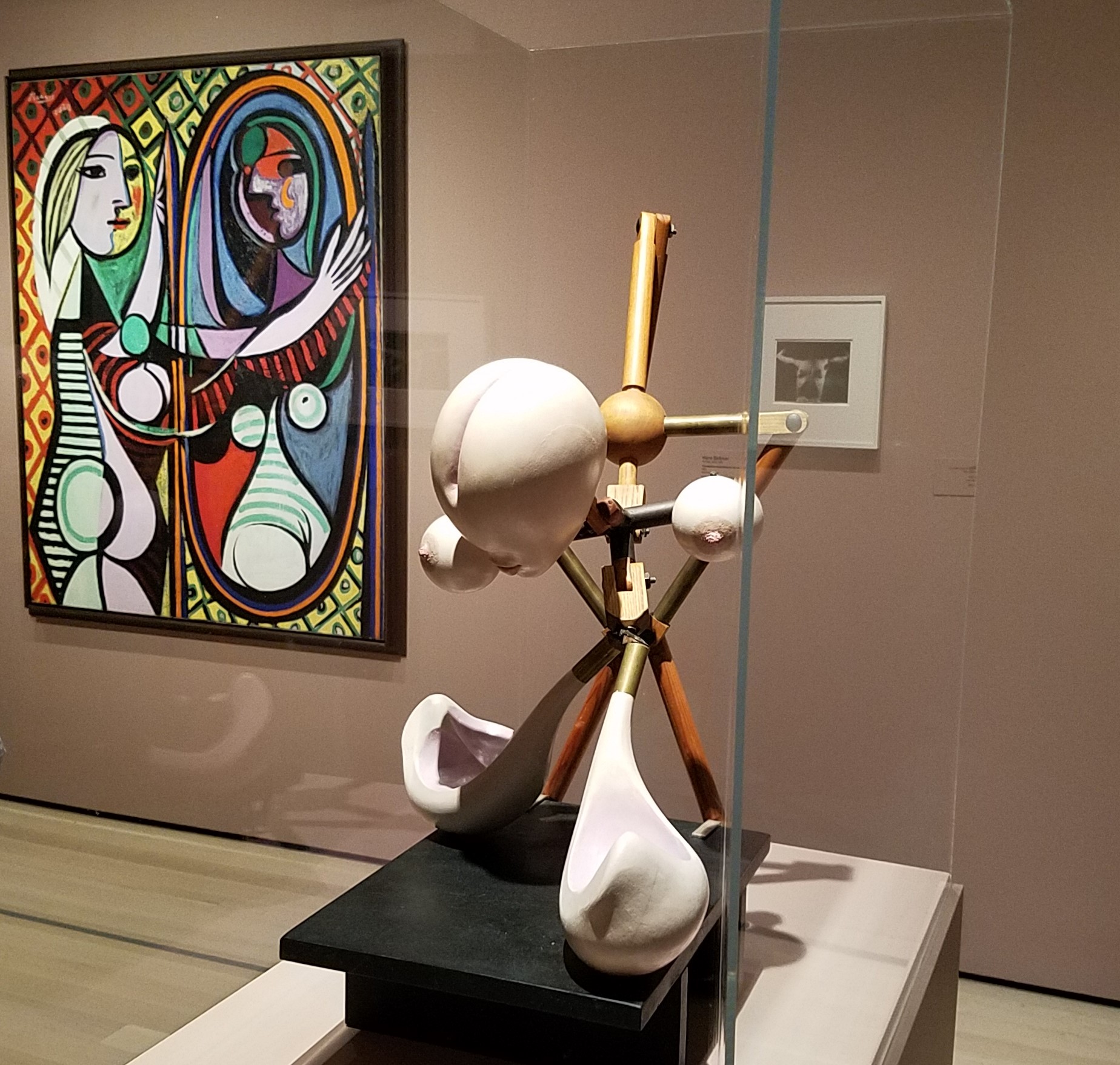
Background right: Pablo Picasso’s Girl Before a Mirror (1932)
Now visitors will be able to see much more of the nearly 200,000 objects in MOMA’s collection in changing rotations. The new curation program rejects the movement-by-movement approach that has long been used to organize the art of the last century. Instead, the art exhibited in some 60 galleries will be serially rehung, with rougly 20 galleries reconceived every six months.
That’s refreshing. I’ve long lamented the fact that so much art in museum collections never sees the light of day, relegated to storage for various reasons, including “inadequate display space”, “it’s less popular”, and/or “it doesn’t fit the curatorial narrative.”
Now, too, MOMA can better respond to the interests of an increasingly diverse audience, providing broader exposure for works by women, African-American and other previously under-recognized artists. “Over the last decade we have dramatically expanded the number of objects in our collection. And, even more importantly, we have expanded who’s represented in the collection,” says Lowry.
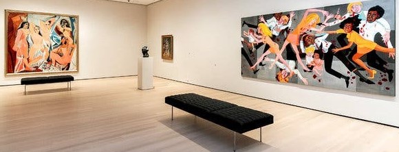
Faith Ringgold”s American People Series #20: Die. 1967
Estate of Pablo Picasso/Artists Rights Society (ARS), New York
Faith Ringgold/Artists Rights Society (ARS), New York, via ACA Galleries, New York
MOMA’s new approach tackles all these points, giving the “second-tier” works in the collection a chance to be appreciated in relation to better-known works by more widely-known artists.
Rejecting the traditional directed narrative, a new cross-media approach co-mingles paintings, works-on-paper, photography, sculpture, digital work, film and audio, and even performance – often challenging the viewer to figure out how they’re related, and to sort through the many sensory inputs.
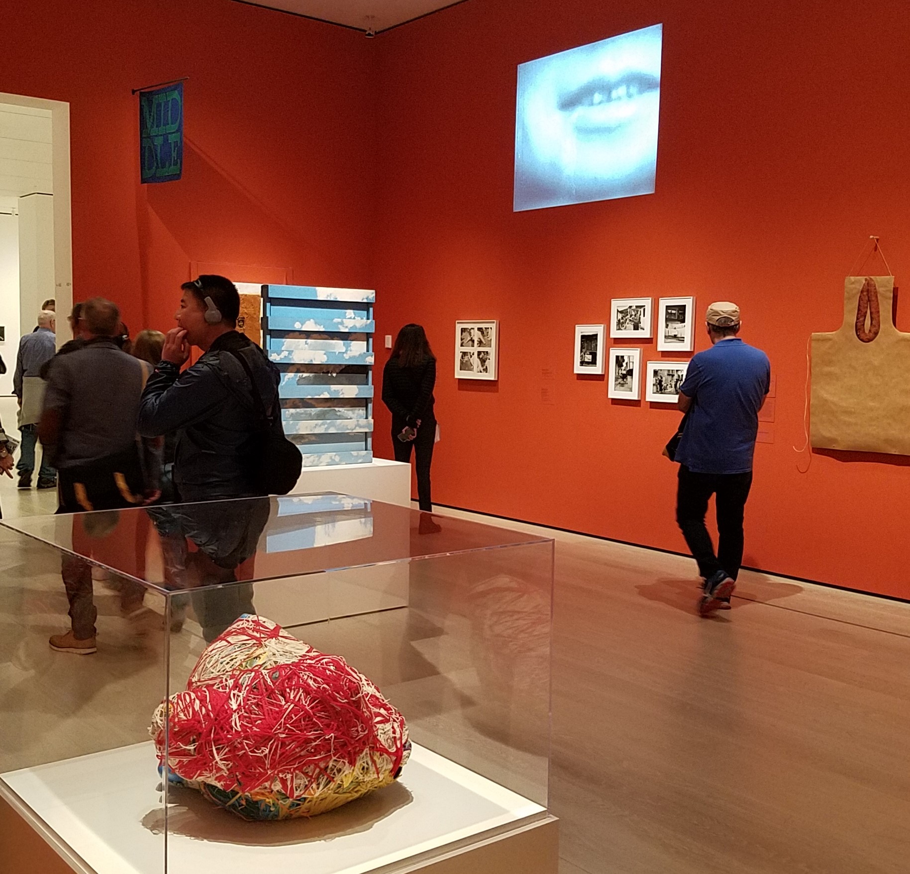
Observing younger visitors interacting with art in new ways — shifting their attention between paintings on the walls and information on their phones — informed the new approach. “Whole new generations are learning first to understand the world through an image,” said Roxana Marcoci, a senior curator of photography at MOMA. “It will never be that perfectly contemplative experience anymore.”
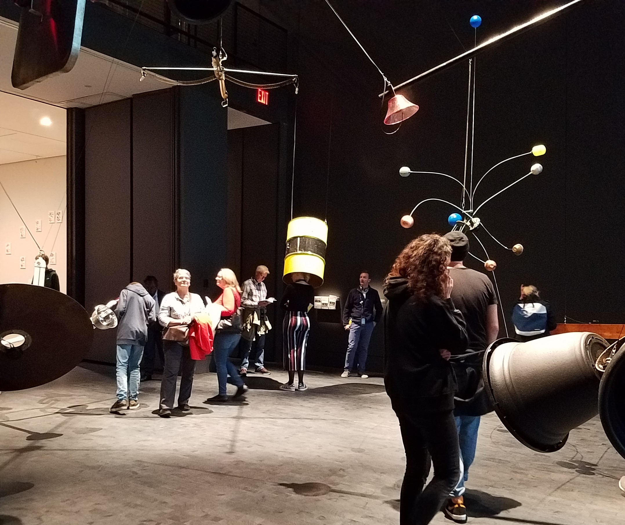
Objects hold sonic transducers, suspended in space to increase their resonance
Director Lowry says the intent is “to try and speak as if we were speaking to a bunch of friends who were interested but didn’t know a lot about art.” Again, it’s a tightrope act: will art-knowledgeable patrons consider this approach to be a dumbing-down of the museum experience?
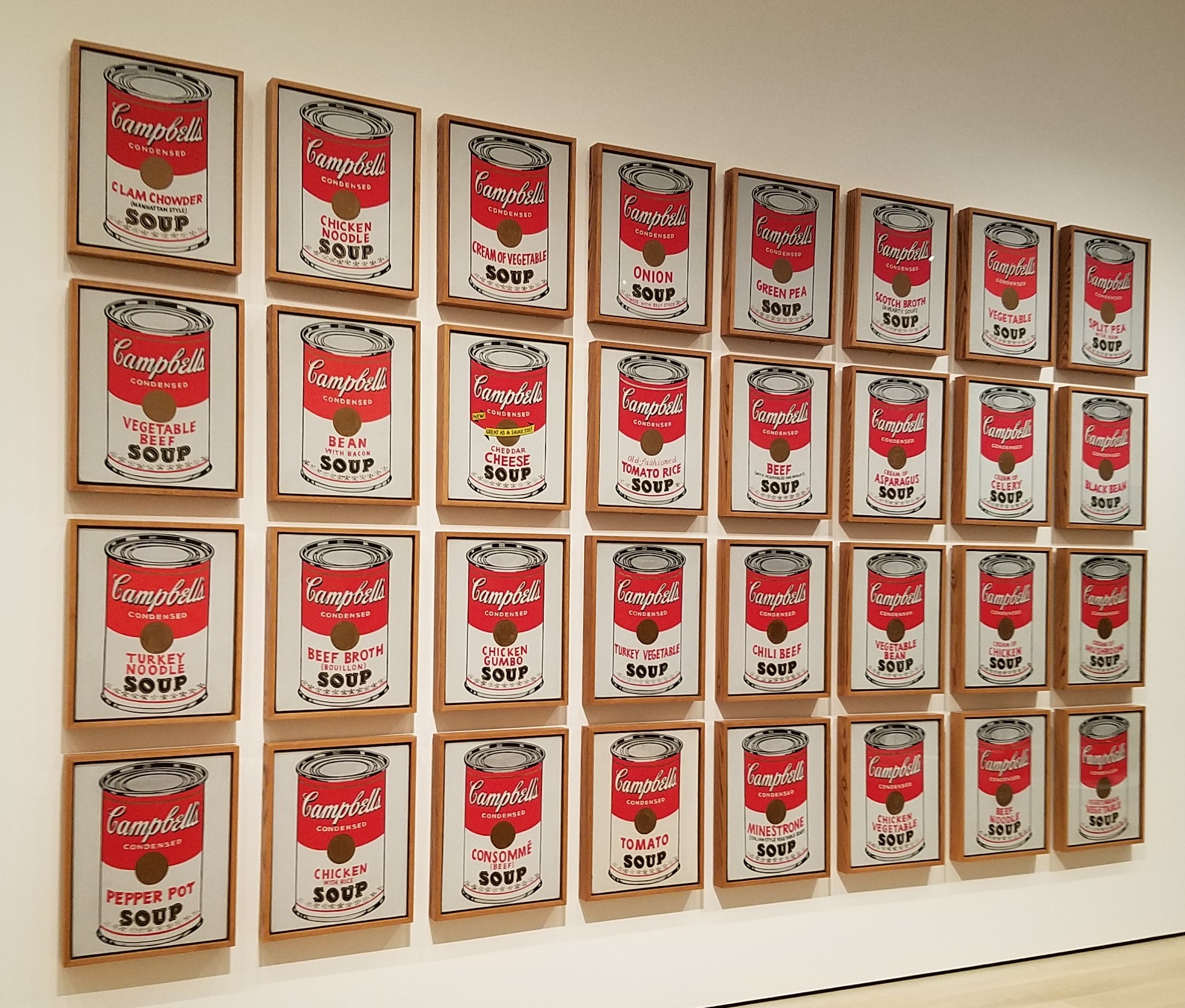
Art-historical language is shunned; even “Pop Art” is avoided, in favor of “From Soup Cans to Flying Saucers” as the label for Gallery 412 showing art of the early 1960s. Avoiding art-specific terminology in their signage aims to make the museum more approachable to people new to the art world. Losing the labels underscores the curatorial view of exhibition-making as primarily the transmission of knowledge and ideas.
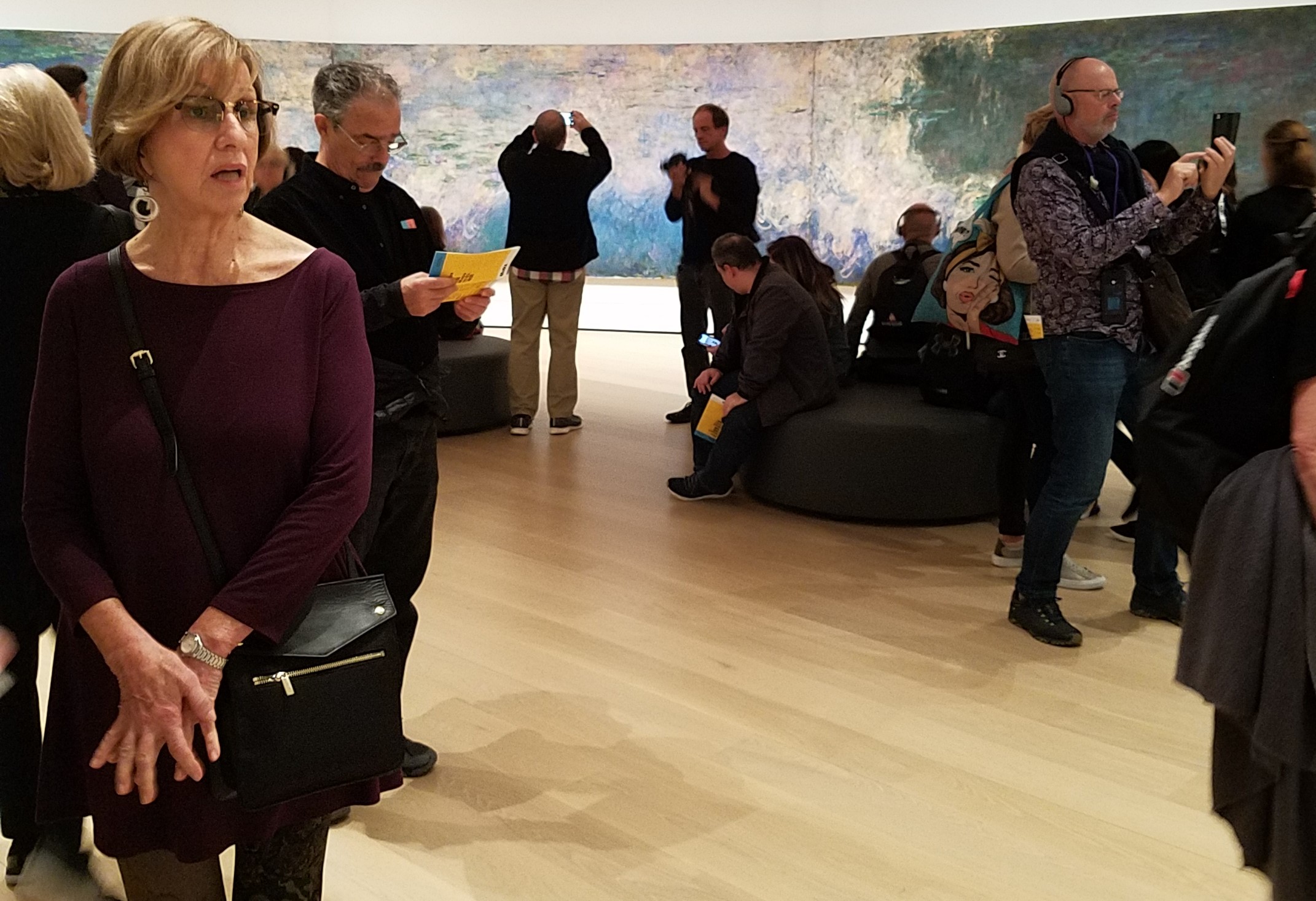
Some of the curatorial concepts escaped us. Now we weren’t fighting crowds, but we were grappling with conceptual disorientation and near-constant sound. We had read about “a chapel-like corner for Monet’s Water Lilies” — a room that would provide a quiet respite from the multi-sensory stimulation. Did I say we never felt crowded? I take it back … this was the one time we did. Apparently, we weren’t the only people in need of relief!
In fact, MOMA isn’t implementing an entirely new concept. I think of it as the “Barnes principle of curation” — mixing works thematically, not entirely chronologically nor by geography or medium. Nearly a century ago, in organizing the display of his collection, Dr. Albert C. Barnes (1872–1951) emphasized “close looking and direct engagement” with works of art, arranging his collection according to perceived relationships between paintings and objects. Minimal labelling, without conventional curatorial descriptions, allowed items to be viewed without preconceptions. He displayed objects from different cultures, time periods and media together, referring to them as “ensembles.” Barnes was decades ahead of his time.
To stay relevant, museums must respond to social and technological change, and must recognize the effects of our digitized daily lives on audience expectations. While surfing and browsing on-line we have become used to processing a constant onslaught of non-narrative, disjunctive inputs.
Speaking for myself, I visit museums for a break from the daily grind. Where else can one go for a calm, restorative, reflective, and gently stimulating appreciation of human creativity and artistic skill?
There is a global trend, especially among modern and contemporary museums, to make the display of their collections more dynamic and to explore new concepts of audience engagement. The new MOMA demonstrates a commitment to lead the way. Time will tell how audiences will react.
Hmmm … maybe it’s time to plan a little trip?
Museum of Modern Art (MoMA)
11 West 53rd Street, New York City, NY
212-708-9400
Art Things Considered is an art and travel blog for art geeks, brought to you by ArtGeek.art — the search engine to easily find more than 1300 art museums, historic houses and artist studios, and gardens across the US.
Hi, I do believe this is an excellent blog. I stumbledupon it 😉 I
may return once again since I saved as a favorite it.